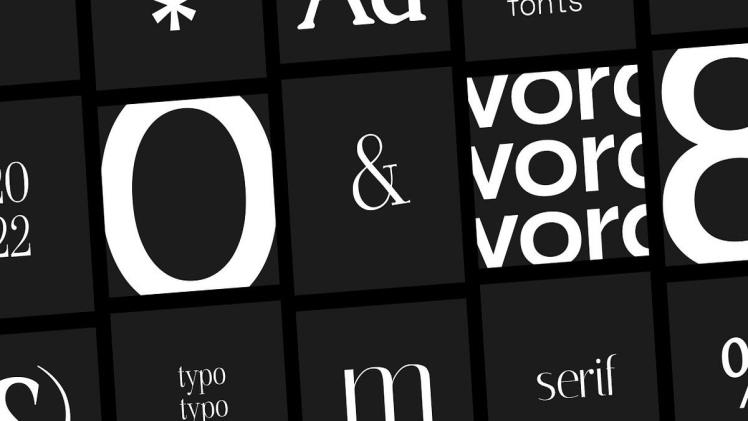
Geometric fonts are a category of typefaces that use geometric shapes as their fundamental design element. These fonts are often characterized by their minimalist and modern appearance, making them popular among designers in recent years.
Geometric fonts have been around since the early 20th century when modernist designers began experimenting with simple shapes and geometric forms in their designs. The fonts were popularized during the Bauhaus movement in Germany, where designers aimed to create functional and straightforward designs. They believed that by using simple shapes, they could create typefaces that were both visually appealing and easy to read.
The most recognizable geometric font is Futura, designed by Paul Renner in 1927. Futura is a sans-serif typeface that features clean lines and simple shapes, making it a popular choice for logos and headlines. Its geometric forms and symmetrical design make it a versatile typeface that can be used in a variety of applications.
Other popular geometric fonts include Avant Garde, Gotham, and Avenir. Each of these typefaces features a geometric design, but they each have their unique characteristics. Avant Garde, designed by Herb Lubalin in 1968, features a combination of geometric shapes and curved strokes, creating a bold and expressive font. Gotham, designed by Tobias Frere-Jones in 2000, is a modern sans-serif typeface that features a geometric design with a humanist touch. Avenir, designed by Adrian Frutiger in 1988, features sccbuzz a simple and elegant geometric design that is often used in print and digital media.
Geometric fonts are versatile and can be used in a variety of applications. They are often used in logos, headlines, and branding materials because they are easy to read and have a modern and minimalist appearance. They can also be used in body text, although this is less common. When used in body text, geometric fonts can be challenging to read because of their simple design, so it’s essential to choose the right font size and line spacing to ensure readability.
One of the benefits of using geometric fonts is their versatility. They can be used in a variety of contexts and work well in both print and digital media. Geometric fonts are often used in branding and logo design because of their modern and minimalist appearance. They can also be used in web design because they are easy to read on screen and load quickly due to their simple design.
When choosing a geometric font, it’s important to consider the context in which it will be used. For example, a geometric font may not be appropriate for a formal or traditional design, as it may appear too modern or minimalistic. Similarly, a decorative or ornate design may not be suitable for a geometric font as it may clash with the font’s minimalist aesthetic.
In conclusion, geometric fonts are a popular category of typefaces that use simple shapes and clean lines to create a modern and minimalist appearance. They have been around for over a century and are still popular among designers today. Geometric fonts are versatile and can be used in a variety of applications, from logos and branding materials to web design and body text. When choosing a geometric font, it’s important to consider the context in which it will be used and ensure that it is faq-blog appropriate for the design’s intended purpose.

